0 → ~4,800 followersover 2 years 6 months, built entirely on original content
One location to twothe second funded by the success of the first, not outside investment
Sole creative throughoutidentity, packaging, interior, motion and social, with no team and no outsourcing
Word of mouth became a channelpeople repeatedly asked staff who was behind the branding, and that brought in new clients directly
CASE01
What they came with
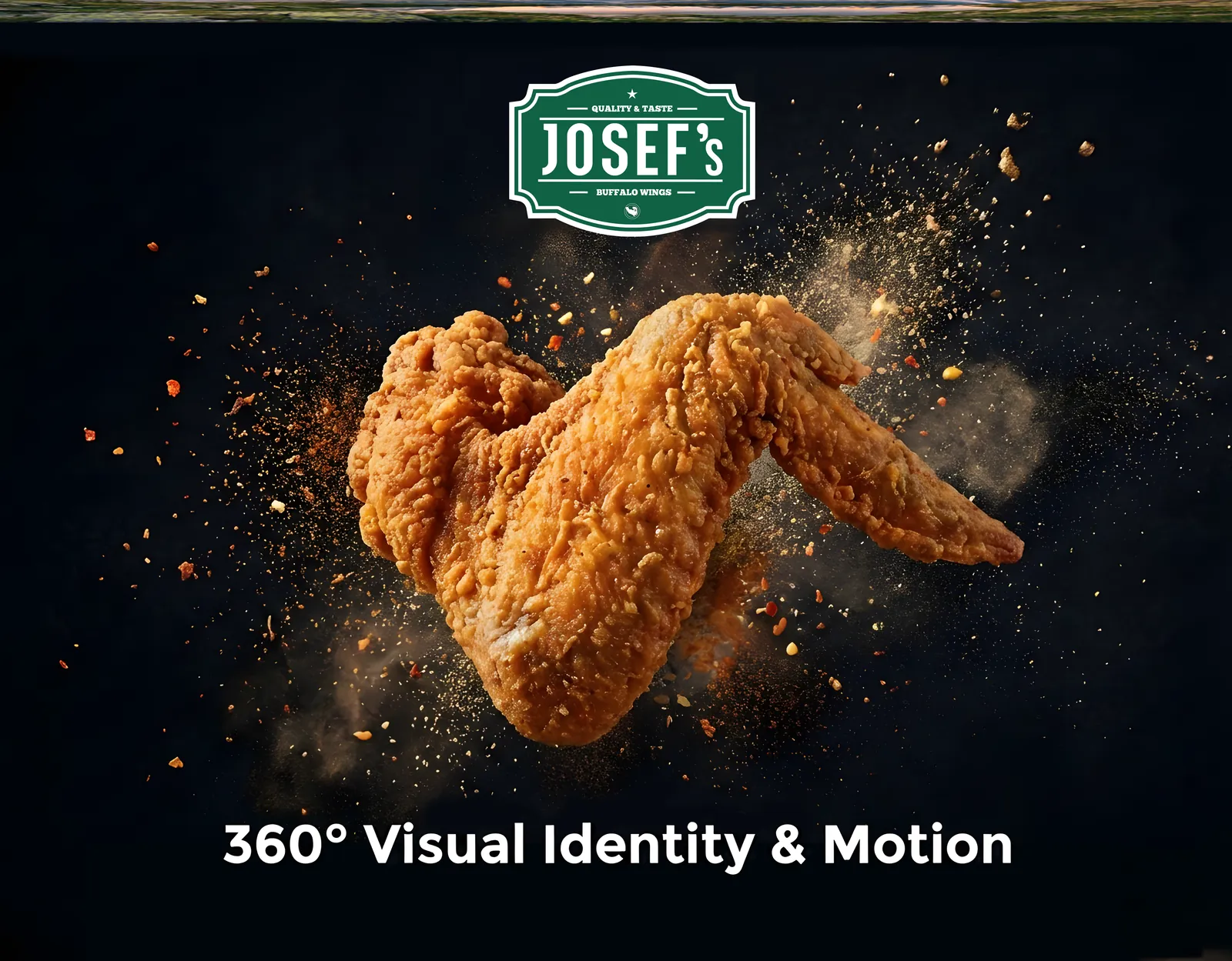
When Josef's came to me there was nothing to build from. No logo, no colour system, no visual language. What they had was a product worth believing in (bold, flavourful buffalo wings), and a plan to open a stall inside Phoenix Center, a busy shopping mall in Hamburg.
The starting point: references, no assets.
Two things made the brief harder than it looked. The wings category already had a dominant reference point in Buffalo Wild Wings, so this needed an identity that read as its own brand rather than a regional copy. And the business had to be unmistakably halal-friendly from day one, a promise that had to live in the visuals, not in a line of text on the menu.
It was also never scoped down to a logo and a style guide. I came on as the sole creative behind everything the brand would ever put in front of a customer, from the mark on the packaging to the walls of the restaurant.
CASE02
How I built it
Rather than borrowing from Buffalo Wild Wings' visual language, I used it only as a category benchmark (a way to understand what a wings brand has to communicate), so Josef's could build something recognisably its own.
Halal positioning, and the colour system built on it
The halal positioning became the anchor for the entire colour system. I chose green deliberately, because it carries an immediate association with halal trust for this audience. The point was to make the promise visible at a glance rather than something a customer had to read to understand.
Green as the anchor: the halal promise.
Warm and family-friendly, not sports-bar
One early call shaped everything downstream: this had to feel warm and family-friendly, not loud or sports-bar coded. That single decision guided the mascot, the typography and the shape language across the whole system.
The mascot: a face, not a full body
The mascot went through several rounds. Two decisions defined it: the buffalo’s face rather than its full body, which kept the mark distinctive and clean at small sizes like packaging and app icons, and rounded forms over angular ones, since sharp edges read as aggressive. I worked wings into the mascot itself to tie it back to the product.
Exploration, left to right: body to face.
A second, emblem-style mark
Alongside the primary mark sits a second, emblem-style logo: a classical, tray-inspired badge for the places the primary mark felt too casual, such as packaging seals and select in-store signage. Those two and the full name lockup are the three marks the rest of the system is built on.
Three registers: mascot, badge and lockup.
CASE03
What shipped
Designing for a screen is one thing. Designing a storefront that has to hold attention inside a moving mall crowd is another.
Packaging built for takeout
The identity extends into packaging (boxes, bags and wing tubs), practical for takeout but reading as one brand throughout. Packaging is the part of a restaurant that leaves the building, so it had to hold up as a brand surface long after the meal.
Interior, facade and signage
The interior and facade followed the same logic, with signage, lighting and colour coordinated so the storefront reads from a distance: first at Phoenix Center Harburg, later at Europa Passage Hamburg. The second build was not a second design. The system already existed, so opening a location became a matter of applying it.
Phoenix Center and Europa Passage, one system.
Animated LED menu screens
The animated LED menu screens were a deliberate choice, not a decorative one. In a mall, foot traffic never stops moving and static graphics get looked past. Motion holds attention in a way flat signage cannot, and it let the boards carry more content in the same amount of screen space.
Motion on the boards: static loses to a crowd.
Building and running the social presence
Beyond the physical brand I built and ran the social presence from scratch: strategy, content, every asset that went out. Gen Z and Gen Alpha are the core audience for a fast-casual concept, and they find new places through what looks good online. Social was not an add-on; it was the most direct route to them.
The profile as a surface, not a leftover.
Content made for the feed, not cut down for it
The content was made for the feed rather than cut down from something else: vertical first, shot and edited for the platform it would live on, and built from the same mascot, colour and type system as the packaging and the walls, so a reel and a wing box read as the same brand.
Built for the feed, not cut down to fit it.
CASE04
Where it landed
@josefs_hamburg grew from zero to roughly five thousand followers over two years and six months, entirely on original content and brand assets built from the ground up. In the same period the business went from one location to two, opening at Europa Passage Hamburg: funded by the first location rather than outside investment.
The finished system, where customers meet it.
Throughout that growth I remained the sole creative across the brand: identity, packaging, interior, motion and social. No team, no outsourcing, continuously from September 2023 until the engagement closed in March 2026.
Identity, packaging, interior, motion — one film.
These figures describe the growth of the brand over the period I led its creative direction. They speak to the consistency and reach of the work rather than a claim of direct causation on revenue. The client's order-volume and footfall figures are confidential.
Word of mouth turned into its own kind of proof: people repeatedly stopped by to ask staff who was designing Josef's branding, and that recognition led directly to new referral clients. Because the client is based in Germany and doesn't run a LinkedIn presence, there isn't a written testimonial to link here, but the growth numbers, the two live locations, and the repeat referral business speak for the work.
CASE05
Delivered
01Brand identity, mascot and emblem logo system
02Colour and type system anchored on halal positioning
This conversation is recorded and shared with Hamza Ashraf so he can follow up personally.
Ask me about Hamza's services, pricing, process or past work. I answer from what is on this site. For anything that needs a decision, I will point you to him.
Answers come from this site. For a quote or a start date, message Hamza.