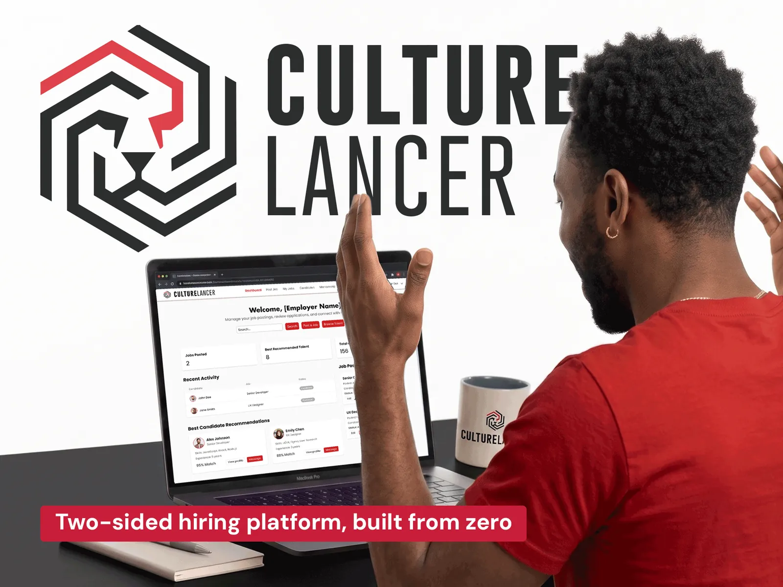
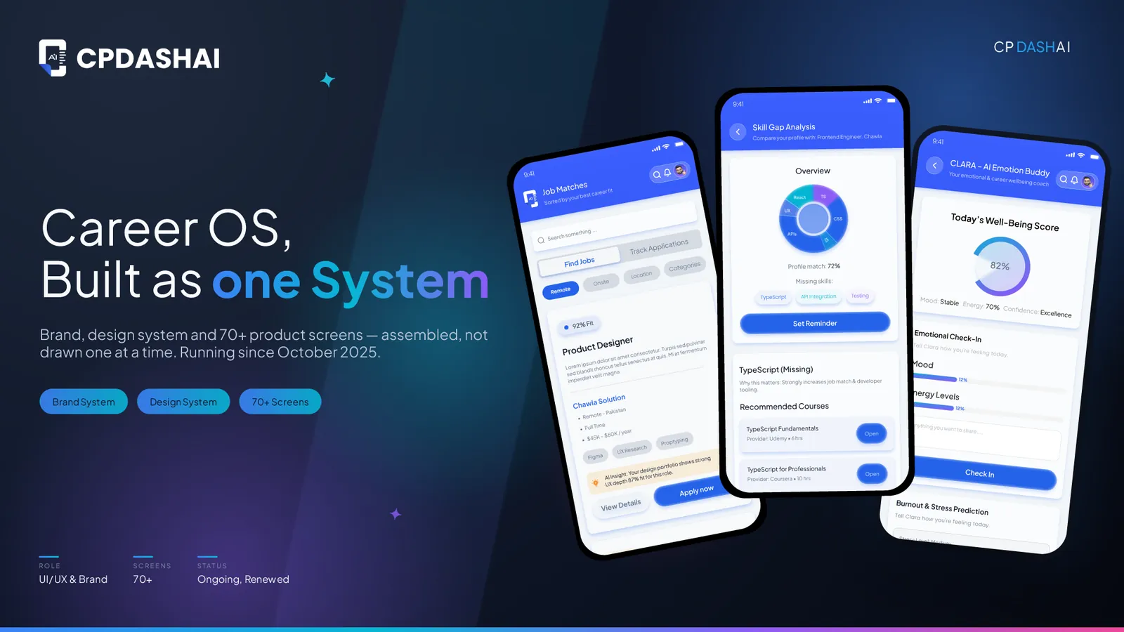
Live and operatinga two-sided hiring platform in use today
A brand, and no productlogo and palette existed; no UX direction, no system, no rules for how anything behaved
Structure before pixelsmindmap, sitemap, annotated flows and low-fi wireframes signed off before high fidelity
One component systema dozen distinct page types read as one product instead of a patchwork of screens
Two sides, one platformseparate dashboards, onboarding and data for job seekers and employers
CASE01
What they came with
CultureLancer set out to solve a real problem: Black professionals were consistently facing barriers to job access, and existing platforms were not built with that audience or that problem in mind. The concept was a freelancer and hiring platform connecting Black job seekers with employers through a fairer, more direct matching system.
By the time it reached me, CultureLancer had a brand identity: logo, typography, colour. What it did not have was a product: no defined audience for the interface, no UX direction, and no design system to build from, no rules for icons, textures or shapes, and nothing describing how components should behave across a real site.
At the start: a brand, and no product for it.
CASE02
How I built it
Two product realities shaped the direction. This was never a single-sided app. It needed two distinct experiences, one for job seekers and one for employers, each with its own dashboard, data, and relationship to the other side. And the brand had to read as bold and forward-looking rather than generic, in a crowded hiring-platform space.
Icon architecture and photography direction
That produced two visual decisions. I built the icon architecture on sharp, angular edges rather than rounded ones, for a confident new-tech feel instead of a safe one. And rather than illustration or a mascot, the platform leans entirely on real human photography (signup screens, empty states, hero sections), because a platform built on trust between real people benefits more from real faces. AI image generation was not credible enough at the time, so every photograph is genuine.
Faces over illustration, the audit, and the recipe that replaced it.
Where the icon system stands
The live product currently ships with standard rounded-style icons: functional, and the safe default while the platform focused on shipping speed. The angular, chevron-and-hexagon set below is the planned next iteration, built from the same geometry as the CultureLancer mark itself, to carry the sharper signature the brand is moving toward.
Sharp over rounded: the icon system, and where it is going.
Mapping the platform in FigJam
I took none of it straight into high fidelity. It started in FigJam, where I mapped the full structure before a single real screen existed: a mindmap splitting the platform into its branches (Job Seekers, Employers, and the shared systems for support, mobile and onboarding), with every page each branch would need underneath it.
Structure first: every branch, every page.
From mind map to a full sitemap
That mindmap became a sitemap: a flowchart running from the home page down through every page either side could reach, with role and location tagged on each node.
Annotated UX flows, one per journey
Two annotated flow boards followed, one per journey, carrying UX recommendations directly on the diagram: guided profile setup and career-path suggestions for seekers, role templates and candidate comparison for employers.
One board per journey, with the call on it: job seeker and employer.
A sprint timeline running alongside
A timeline ran alongside the whole thing in two-to-three day sprints, from setup through wireframes, client reviews, prototypes and final adjustments.
Low-fidelity wireframes, signed off before colour
Before anything went to high fidelity I built low-fidelity wireframes for both sides myself, as a structuring tool: a way to lock layout and page logic and get sign-off before investing in visual design. That kept revisions cheap, and meant every high-fidelity screen that followed was already validated in structure.
Structure signed off in grey, before colour: job seeker and employer.
A component system, not a screen-by-screen build
I then built the site around a component system rather than screen by screen, defining navigation bars, cards, buttons, form fields and type styles once each and reusing them with variants and states, on a consistent scale. New pages could be assembled instead of redesigned, which is what keeps a dozen distinct page types reading as one product.
Defined once, reused across a dozen page types.
CASE03
What shipped
The entry point had to work for two audiences without feeling like two products. Job seekers and employers each get their own path from the very first screen, with the choice presented clearly upfront rather than buried in a settings toggle later.
The job seeker profile builder
For job seekers the platform front-loads profile information deliberately: personal details, experience, education, portfolio projects, awards and certifications, specialisations and social links, all collected in a structured multi-step flow. That is not friction for its own sake: richer profile data upfront is what makes the matching sharper later.
The job seeker dashboard and job detail
Once the profile exists, the seeker gets a dashboard with a skills assessment, a match-based job feed, and messaging with the employers who responded to their application, rather than the other way round. A listing opens into the full role detail from the same feed, so applying never means leaving the page they were scanning.
The employer dashboard, built for candidate discovery
The employer dashboard is built around candidate discovery rather than job browsing: best-matched candidates, applied candidates per job, and analytics on job performance and applications over time.
Posting a job, with an AI description assistant
Posting a job includes an AI-assisted description tool, so an employer with a rough idea still ends up with a complete, well-matched listing. Candidates apply to specific postings rather than messaging cold, which keeps the employer inbox to people who actually fit.
Messaging, courses and employer membership
Three shared systems tie the two sides together: direct messaging between matched employers and candidates, a courses and certifications section that lets job seekers build verifiable skills on-platform, and a tiered membership structure for employers who need more postings or advanced search.
CASE04
Where it landed
The project delivered more than a UI layer. It delivered the product’s actual interaction logic: planned in FigJam, validated through low-fidelity wireframes, and translated into a design system the client could understand and build from with confidence. CultureLancer is live and operating today.
The same argument in eleven seconds: structure first, then one component system, then the platform it built.
CASE05
Delivered
01Sitemap, user flows and annotated UX recommendations
02Low-fidelity wireframes, both sides, for client sign-off
03Design system architecture and component library
04Two-sided onboarding and signup flows
05Job seeker profile builder and dashboard
06Employer dashboard, posting flow and candidate views
This conversation is recorded and shared with Hamza Ashraf so he can follow up personally.
Ask me about Hamza's services, pricing, process or past work. I answer from what is on this site. For anything that needs a decision, I will point you to him.
Answers come from this site. For a quote or a start date, message Hamza.